


Bootstrap is the most popular CSS framework. Moreover, it is not just a CSS framework but also a JS framework. It contains pre-written styles and scripts that can be applied by simply adding the necessary style classes and attributes to HTML elements. It is perfect for mobile project development, primarily due to the Bootstrap grid, which allows for easy adaptation of any site to display well on any device.
You should also read: How to Delete a Google Account – Detailed Guide
Why Do You Need Bootstrap?
A CSS framework is a file or a set of files with pre-written code that connects to the site in the head section, simplifying the site layout. If you develop a site from scratch, you have to take care of many things. All CSS styles and web scripts have to be written from scratch, which could amount to hundreds or thousands of lines of code. Moreover, there could be numerous layout errors. For example, the template might look different in major browsers or might not be adaptive.
Adaptive layout is precisely why Bootstrap should be used, as it makes fixed layouts easy to create from scratch. However, creating an adaptive layout is much more complex. The site needs to display well at any screen resolution, which requires many media queries, and knowing how to write them.
What About Bootstrap? This framework greatly simplifies layout. It handles cross-browser compatibility and adaptiveness, which are the main things a developer needs to ensure. It allows even someone with little layout experience and minimal CSS knowledge to create an HTML template.
This framework is perfect for team work. Layout creation, with proper skills and understanding, is 3-5 times faster, and code uniformity allows any colleague to make edits.
Minimum Set of Tools for Bootstrap Development
Before connecting Bootstrap and creating site and web application designs based on it, you need the following minimum set of programs:
- A code editor (Visual Studio Code, Sublime Text, Atom, etc.) or IDE (WebStorm, NetBeans, etc.);
- A browser (Google Chrome, Mozilla Firefox, Safari, Microsoft Edge, Opera, etc.).
How to Connect Bootstrap
Creating a web project design based on Bootstrap always starts with its installation.
Bootstrap can be connected to a site in three main ways:
- Build from Source Codes. This option is mainly used when you need to customize Bootstrap in detail for your project and exclude all unnecessary components and plugins. It is more suitable for advanced developers.
- Connecting via CDN. This is the simplest installation option. Nothing needs to be downloaded here. You just need to insert a link to the files hosted on CDN servers into your HTML.
- Local Installation. For local installation of Bootstrap (with default settings), you need to download the ready-made build from GitHub. Then unpack the received archive and copy the minified versions of the files into your project. Connect these files to the HTML page. These builds contain compiled and ready-to-use CSS and JavaScript files. This option is more suitable for projects with no significant design requirements that can be executed in the styles laid down by the framework authors by default.
How to Work with the Bootstrap Grid
The Bootstrap grid is used to divide the user interface into clearly defined sections and rows, which will look logical on screens of any size and resolution. It helps create layouts suitable for various devices – from desktops to smartphones.
Basic Principles
The Bootstrap grid is divided into 12 columns. Each row can contain from 1 to 12 columns.
- Bootstrap provides classes for creating rows and columns. For example, the .row class is used to create a row, and the .col-sm-4, .col-md-6, and .col-lg-12 classes are used to create columns that occupy 4, 6, and 12 columns on small, medium, and large screens, respectively.
- A spacing system is used to create space between elements. You can use .offset- classes to shift columns to the right or left. The .text-left, .text-center, and .text-right classes are used to align text in columns.
Example:
HTML
html
Копіювати код
<div class=”container”>
<div class=”row”>
<div class=”col-sm-4″>Column 1</div>
<div class=”col-sm-4″>Column 2</div>
<div class=”col-sm-4″>Column 3</div>
</div>
</div>
This code will create three columns, each occupying 4 columns on small screens. On medium screens, columns 1 and 2 will each occupy 6 columns, while column 3 will occupy 4 columns. On large screens, all columns will occupy 4 columns each.
How to Use Bootstrap – Video
To better understand how to use this popular framework, watch the video:
Conclusion
Bootstrap is a popular and convenient CSS framework. Its advantages, such as simplicity, accessibility, and functionality, make it a great tool for both beginners and experienced developers. With it, creating websites is much faster and easier.
Frequently Asked Questions about Bootstrap
First, you need to connect Bootstrap using one of the described methods and understand the instructions.
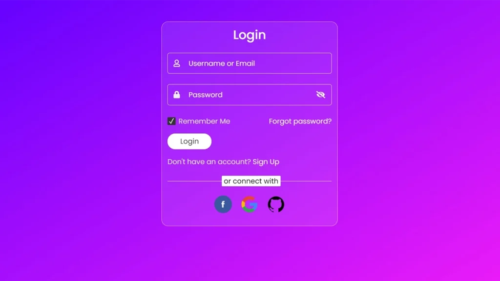
The framework has many components, practically everything that may be needed for developing typical sites – dropdown menus, buttons, alerts, tabs, progress indicators, breadcrumbs, lists, headings, etc.
The latest version is 5.3.1, but new versions are constantly being released, and the old ones remain functional.


